PROJECT: SAFERWORLD MODEL FOR CHANGE
CLIENT: SAFERWORLD
Saferworld is an independent international organisation working to prevent violent conflict and build safer lives. They work with people affected by conflict in over 10 countries across Asia, Africa and the Middle East - to improve their safety and sense of security and to evolve better policies and practices at local, national and international levels that can help build lasting peace.
OBJECTIVE
To create an illustrative graphic of Saferworld’s model for organisational change, as part of their new strategic plan. It should explain visually who Saferworld are and what they do, as an organisation with a clear vision, purpose and strategy.
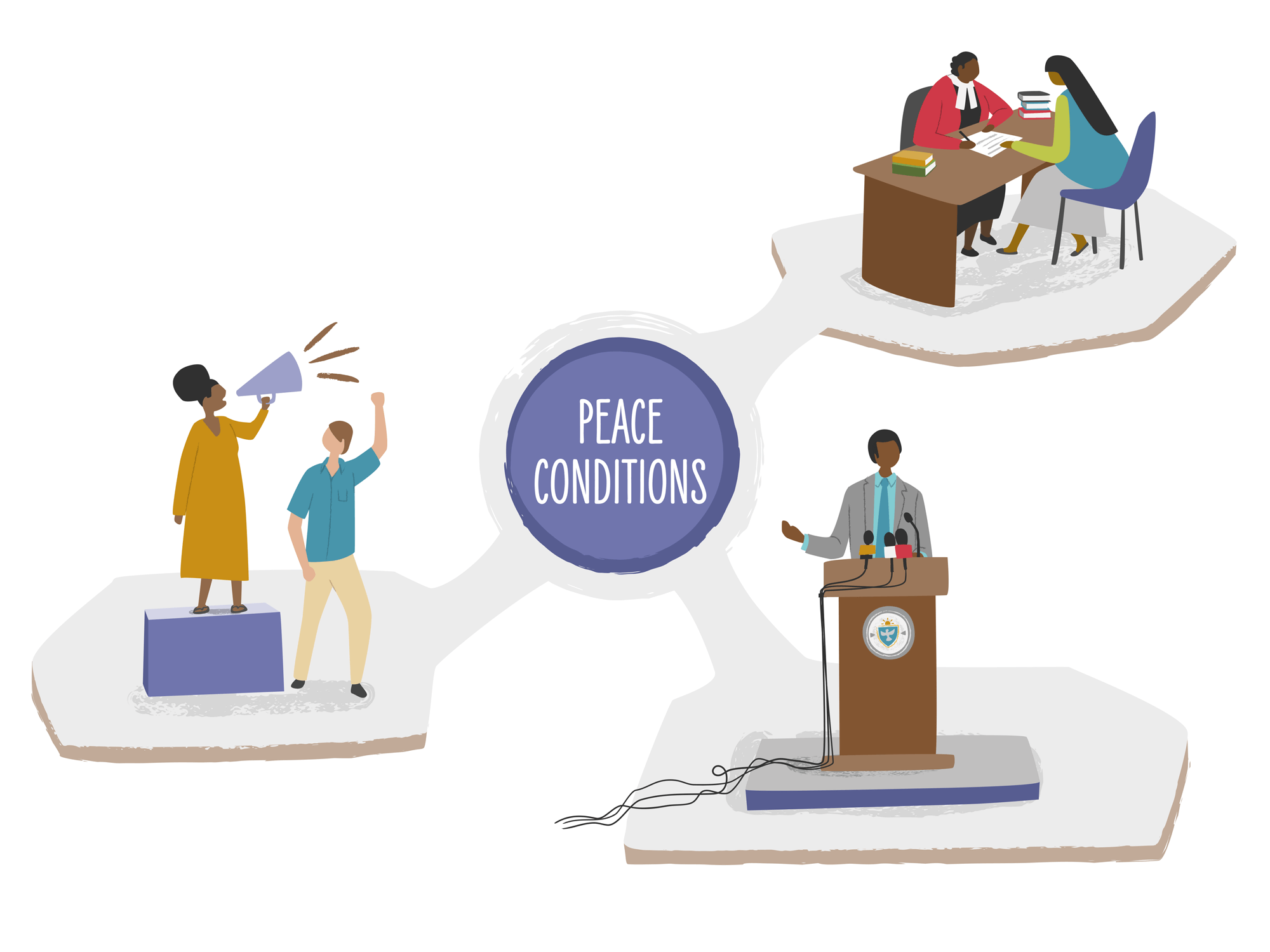
I was briefed to create an overall graphic that felt simple, but conveyed the idea of a journey/progression, through Saferworld’s strategic objectives, approaches, and general values towards what are defined as the essential conditions for peace.
The strategic plan, which includes this graphic will be seen by the organisation’s donors (both current and prospective), Saferworld staff and Board of Trustees, partners they work with at different levels and other interested parties such as other peacebuilding NGOs - As well as explaining the Saferworld strategy, it should also allow these individuals to identify themselves and understand how their roles fit within the broader organisational strategy.
The Saferworld brand uses purple and pale grey - I was asked to incorporate these colours, but encouraged to introduce other suitable colours to complement the existing brand.
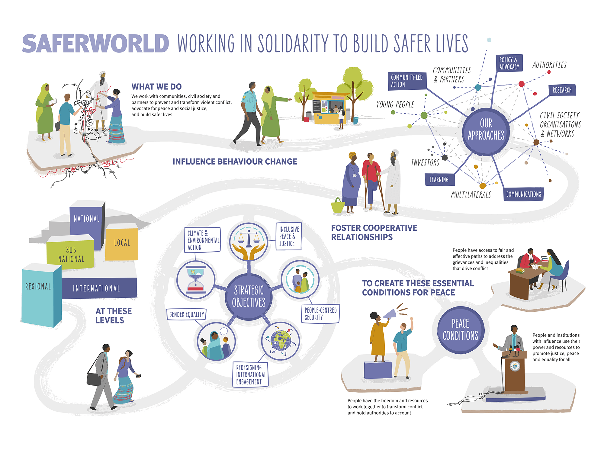
Saferworld: Model for Organisational Change. (Click to enlarge..)
The final graphic tells the Saferworld story of contributing to change. As an organisation they pride themselves on a holistic and integrated approach, where all elements of the journey are connected and influence change, but can be adapted for different cultural contexts.
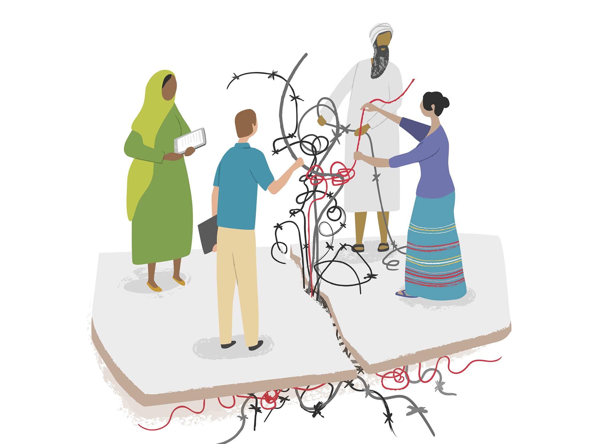
The start of the journey: Working with partners to unravel the underlying issues of conflict
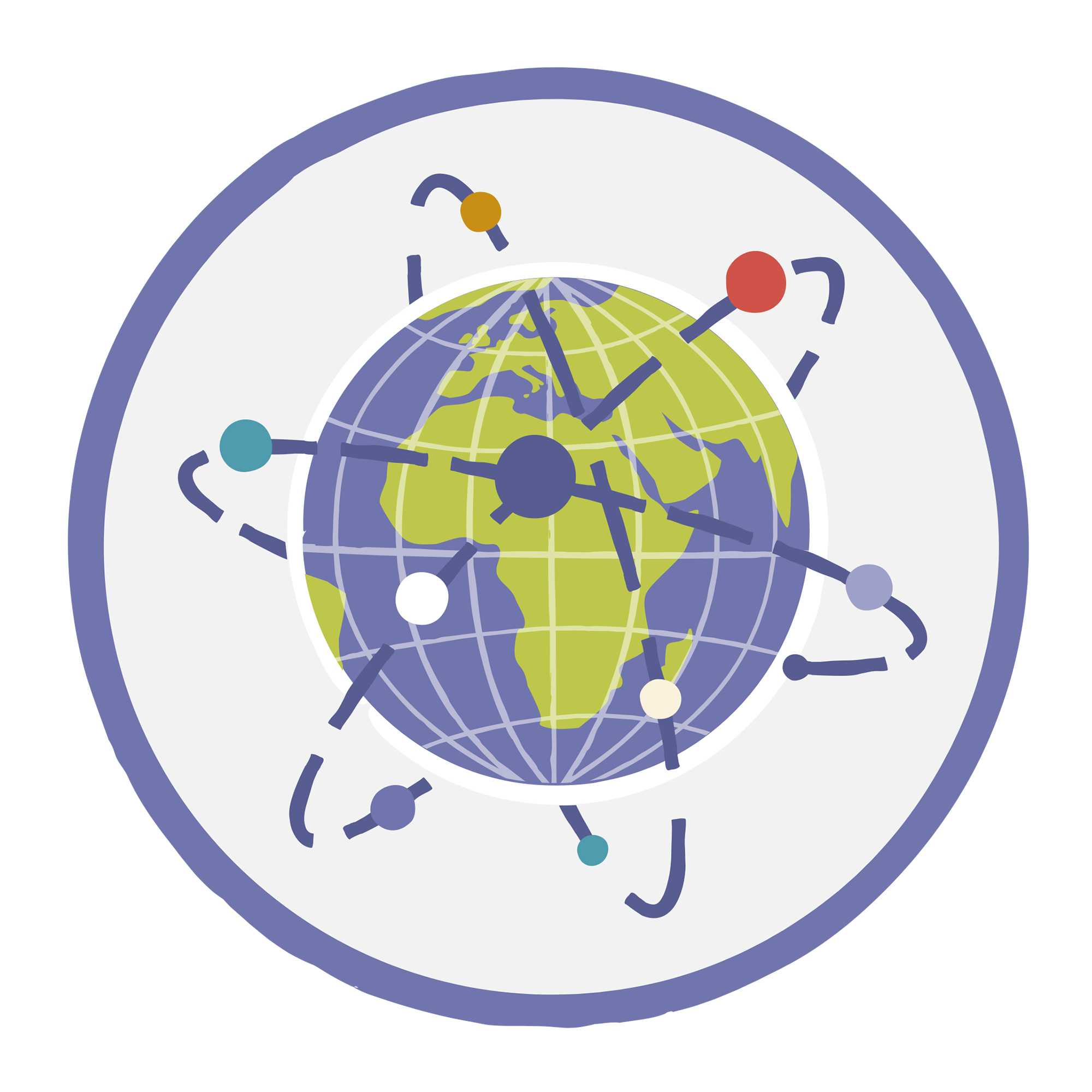
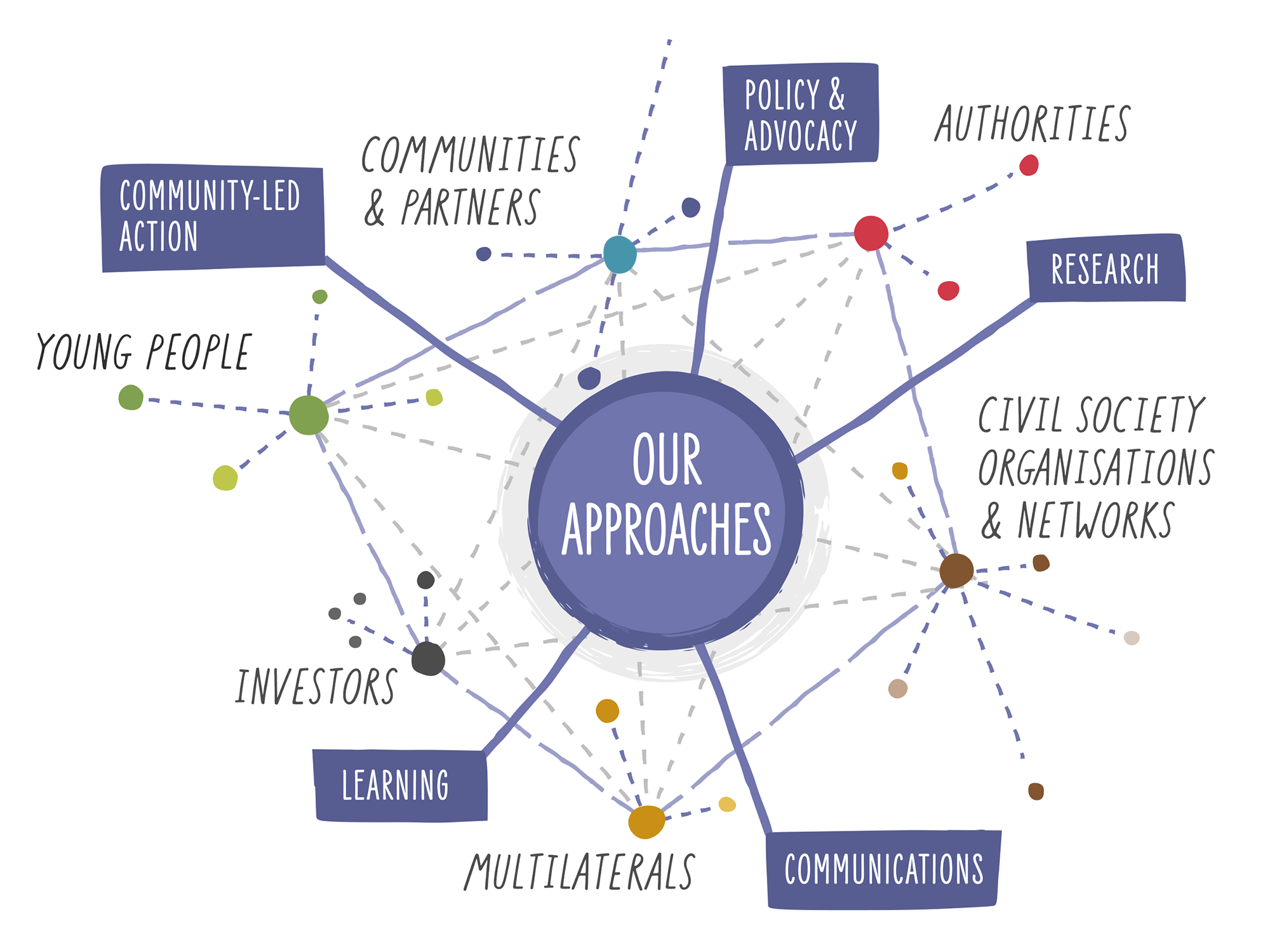
Engaging with different groups of people at different levels, to build networks and work around the various approaches
In creating the design, it was important for there not to be any sense of hierarchy or a set order for approaching individual aspects of the journey. For example, the Levels and Strategic Objectives parts of the journey (shown below) were laid out ways that didn’t imply any one element was more important than another, or that they should be worked through in any particular order.
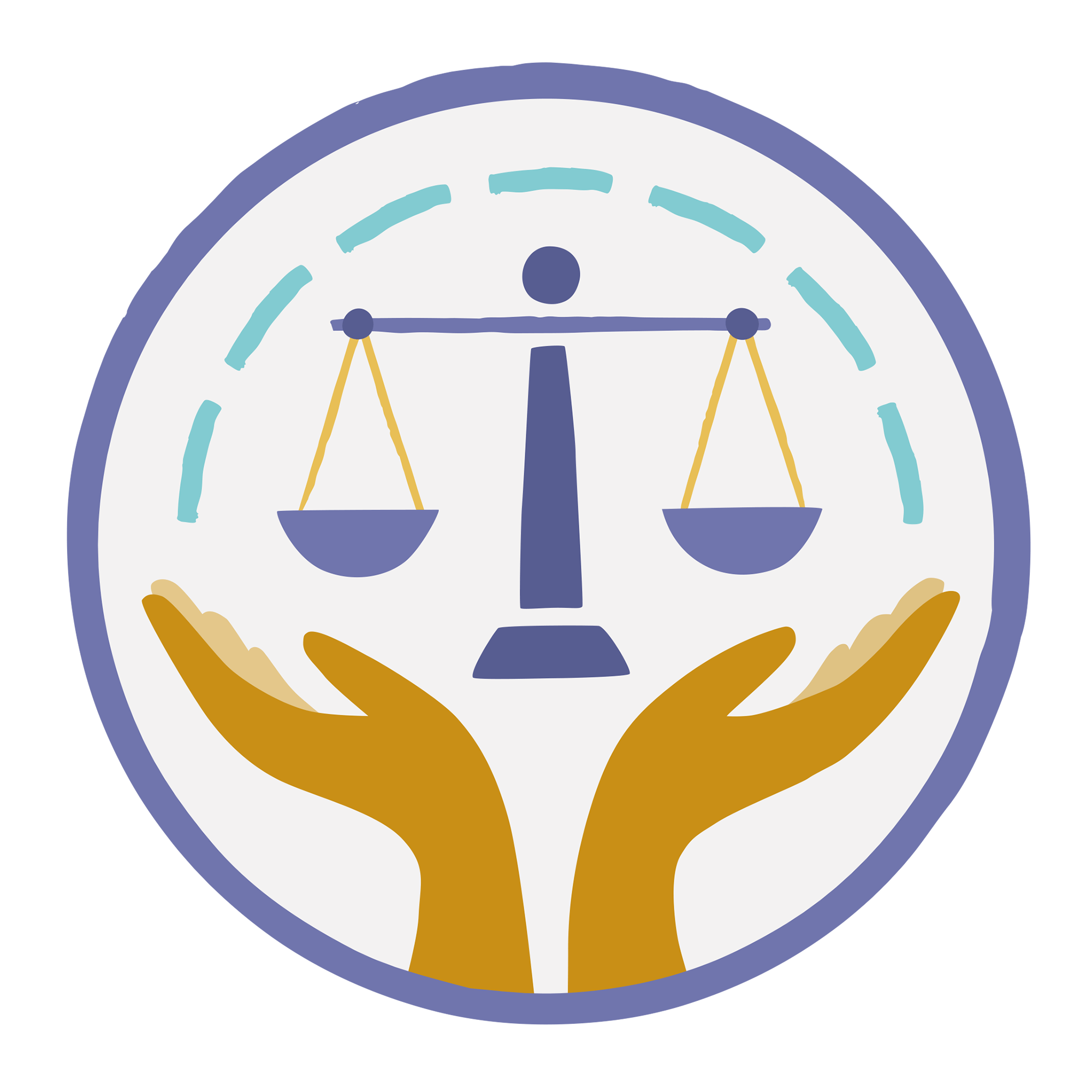
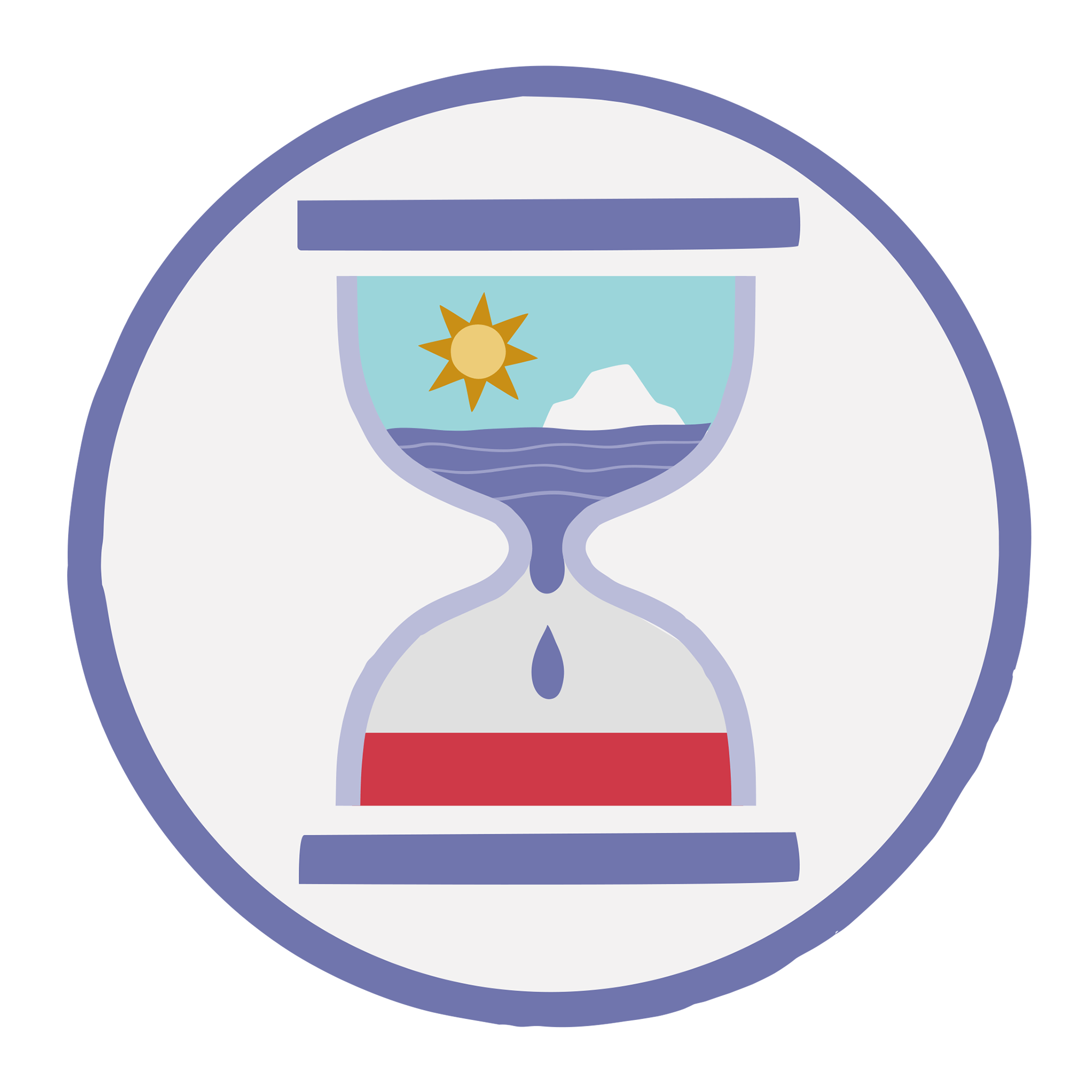
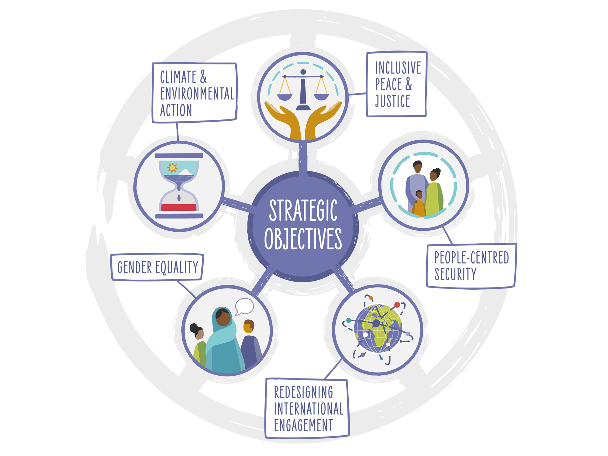
A set of 5 icons were created for each of the Strategic Objectives - these will also be used individually
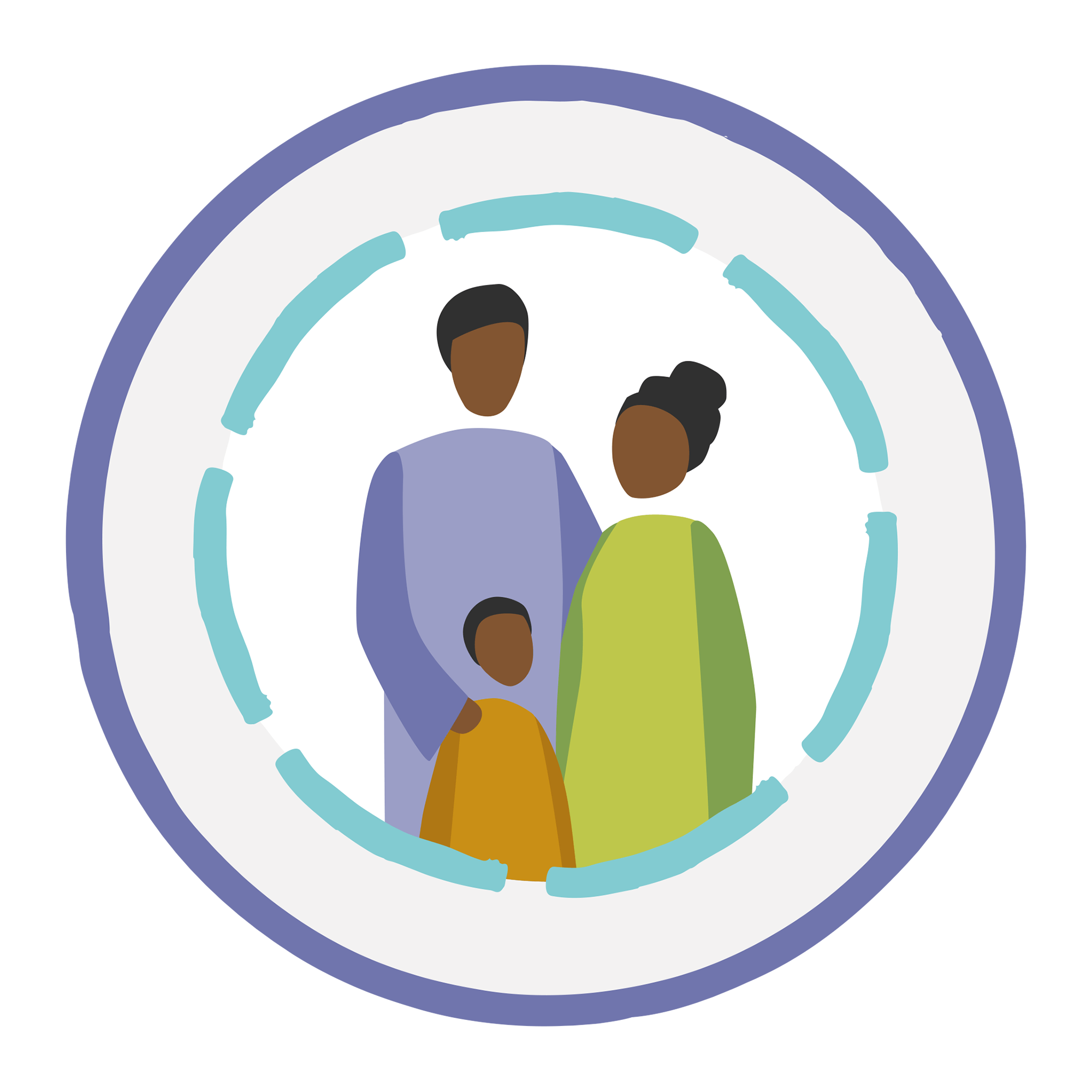
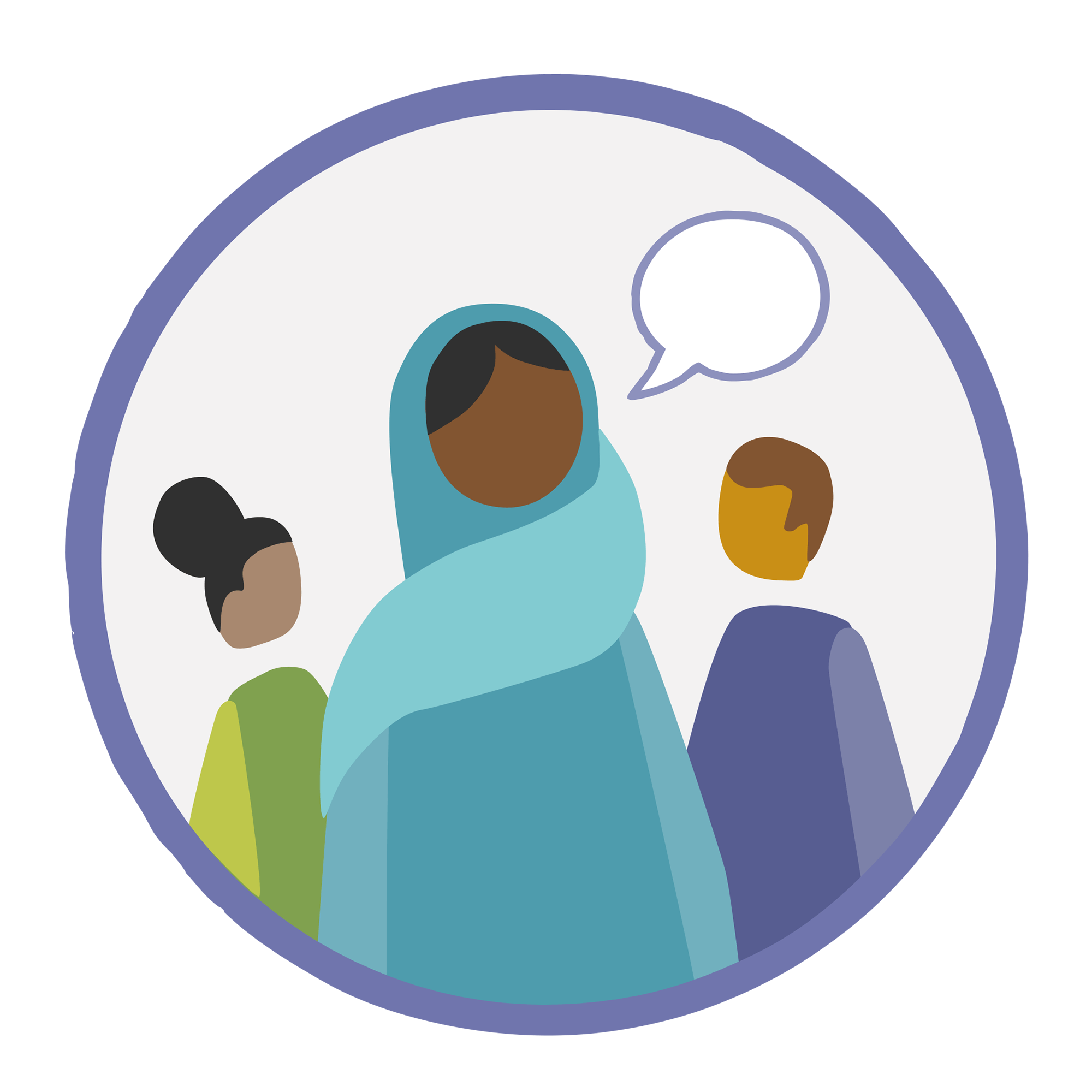
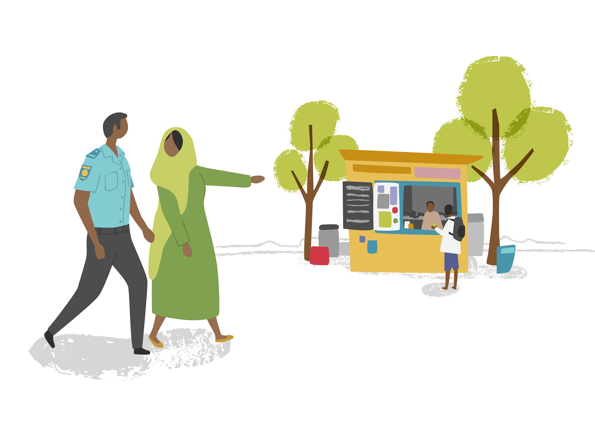
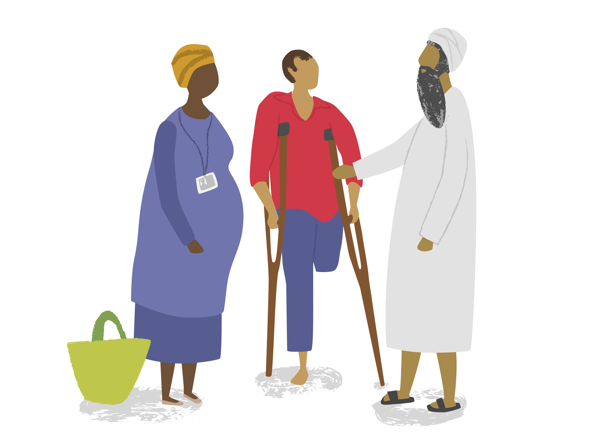
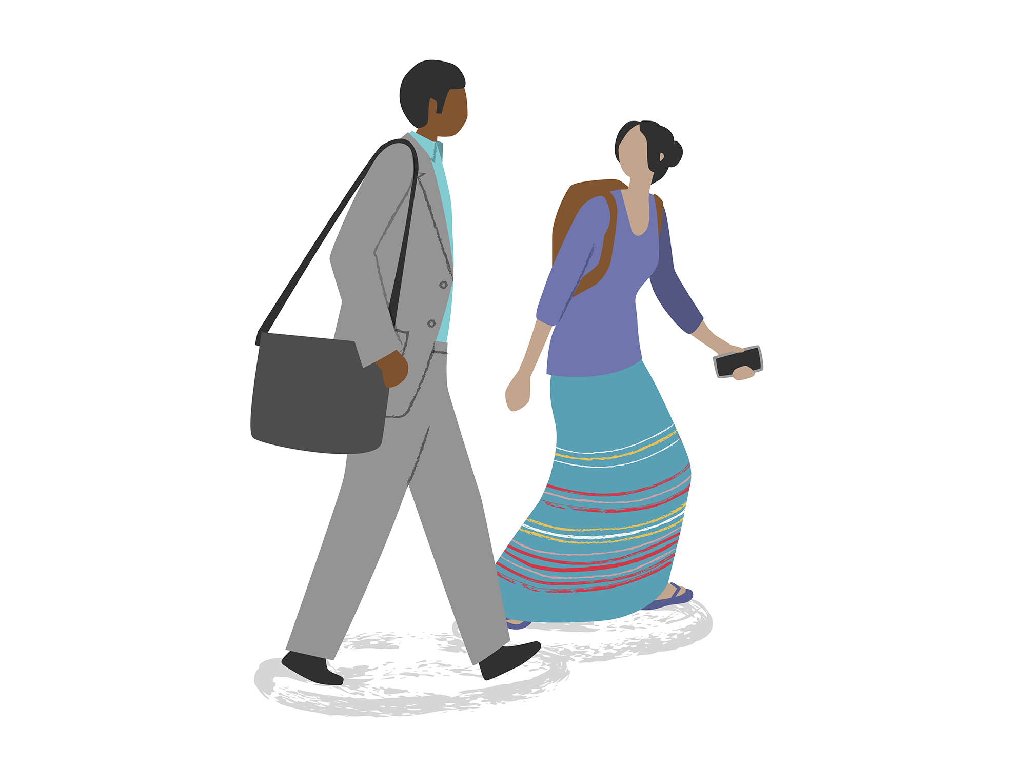
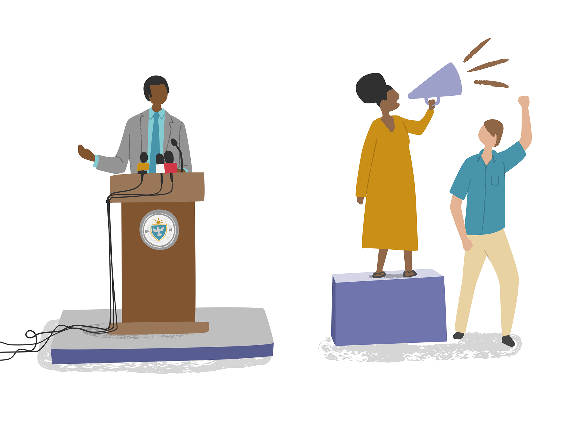
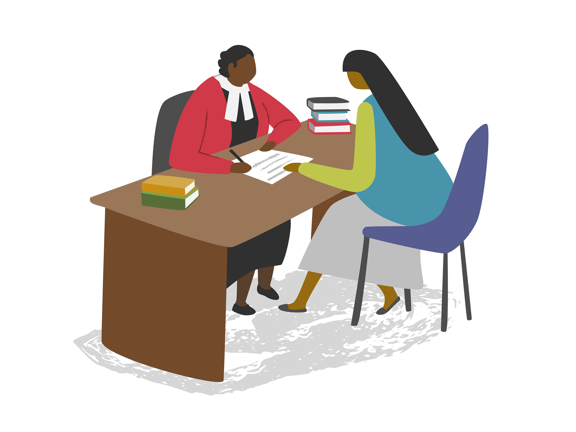
Saferworld collaborates with different individuals and organisations throughout the process of working for change. I was briefed to include a range of people on the journey, and that some of the characters should appear at different stages of the journey
PROCESS: THE EARLY STAGES OF THE PROJECT
It’s often interesting to look back at the initial stages of a project…
In this instance the original brief evolved after I started the project. The Strategic Objectives were to share prominence with other areas of Saferworld’s overall approach and to incorporate more reference to the individuals they work with. This was discussed with the client and the approach adapted along with an increased fee to reflect the additional work.
Pictured below is the first sketch I showed the client, and then a couple of later ones before progressing to the artwork stage.
Initial sketch
Final pencil sketch before moving to the artwork stage
The nature of the project such as this, with various levels of complexity, subtleties and sensitivities meant that it took a few sketch stages to get everything right! Taking on board comments from the client on the above sketch, I opted to next show what I call a ‘hybrid sketch’ (part sketch, part finished artwork)… Sometimes it’s easier to work something out and show how it could look by actually making it properly, which is what I’ve done below for the Levels and Approaches sections. Also at this stage I have begun to work up some of the elements that had already been signed off, to give the client more of an idea how the final graphic would look and my proposed colour palette.
Hybrid sketch - part sketch, part worked-up elements
The final graphic again, for comparison
Copyright for the Saferworld Change Model Graphic is shared between myself and Saferworld
© Carys-Ink Illustration & Design/Saferworld
CLIENT FEEDBACK
Throughout this project I worked over a number of months with 2 key members of the Communications Team at Saferworld. Once the project was complete, Alexandra Azúa Hale, Communications Manager, offered her feedback and some insights into the process of working with me….
• I believe you looked at other illustrators who may have been able to create the Change Model Graphic… What was it that led you to approach Carys in the first instance and then to decide that she was the best fit for you and specifically this project?
Looking at previous examples of Carys' work on her website, there were similar graphics that looked like something we had in mind for ours. This was incredibly useful to discuss with Carys as a reference point, but it also helped refine our own thinking. Once we had a discussion with Carys about our ideas, it was clear that she had a better understanding of what we wanted.
• From your perspective, what were the key challenges of the project?
The key challenges came from our side which meant there were several repeated rounds of feedback and changes to the brief coming from the executive level. Carys was very understanding to these changes and was able to incorporate more rounds of feedback and development time. She was also flexible on timeframes which again was massively helpful as the feedback process took much longer on our side than anticipated.
• How did you find the process? It’s fair to say the brief evolved once the project had started, do you think Carys adapted well to this or did it present issues?
Carys adapted very well to the evolution of the brief and was very accommodating to all our feedback, including that which was more vague and required more thinking and iterations. She was also very patient with last minute changes to details of the different characters and icons.
• Are you happy with the final work and how has it been received by your wider team and partners so far?
Saferworld is extremely happy with the final graphic. We have received great feedback from staff across the organisation. We are still in the process of rolling the graphic out to donors and partners.
• And finally, if you were to describe Carys to someone else looking to commission illustration for their organisation, what would you say?
She is very thorough, patient, creative and detail-orientated. A pleasure to work with!
- Alexandra Azúa Hale, Communications Manager, Saferworld


