PROJECT: CHARACTER DESIGN & MURAL ARTWORK
CLIENT: PROTON PARTNERS INTERNATIONAL/RUTHERFORD CANCER CENTRES
Rutherford Cancer Centres were in the process of opening a network of cancer centres nationally and internationally, to offer state-of-the-art treatment and exceptional care to patients. The Rutherford was the first of their UK centres, based in Newport, South Wales.
OBJECTIVE
To create a 'space themed' mural design to wrap fully around the walls of the children & young people's waiting room at The Rutherford in Newport. I was briefed to develop a range of space themed characters and a landscape which would be fun and engaging for children roughly aged 3-12. The idea was that the design should feel like an adventure or journey, rather than in any way being dark or 'alien', and to provide a colourful but calming environment for children to play in ahead of their treatment.
The mural was to be produced as digital artwork, which would be printed to a vinyl wallcovering and installed at the loction.
MURAL CONCEPT
The following is part of the overall concept I proposed to the client, in response to their brief:
"Six intrepid characters on an inter-planetary voyage of discovery and adventure. From the comfort of their mothership - The Ruthership - they journey to exotic far-away planets to explore and experience new things. A close-knit team of friends who support each other with immense courage as they follow uncharted paths and face unknown challenges...having lots fun along way! They collect mementos and keepsakes to remember places they’ve been and how far they have come together - colourful gemstones are a firm favourite with them all.
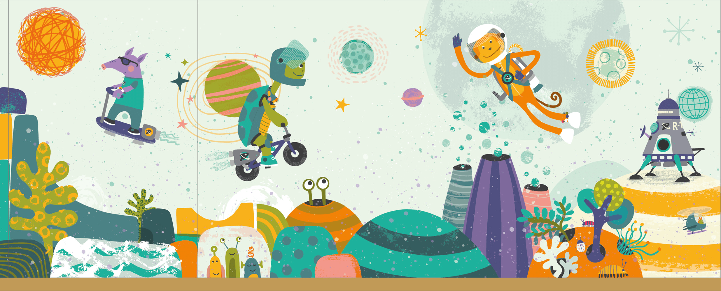
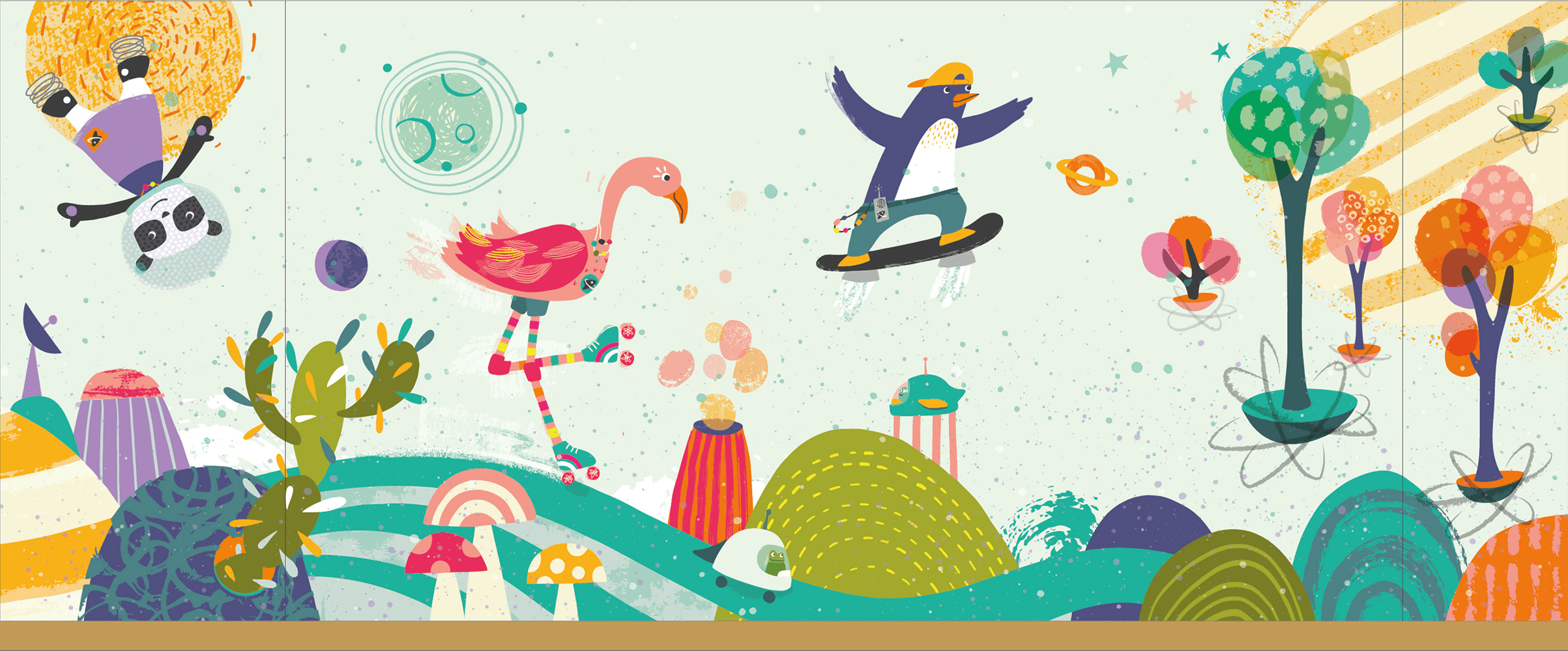
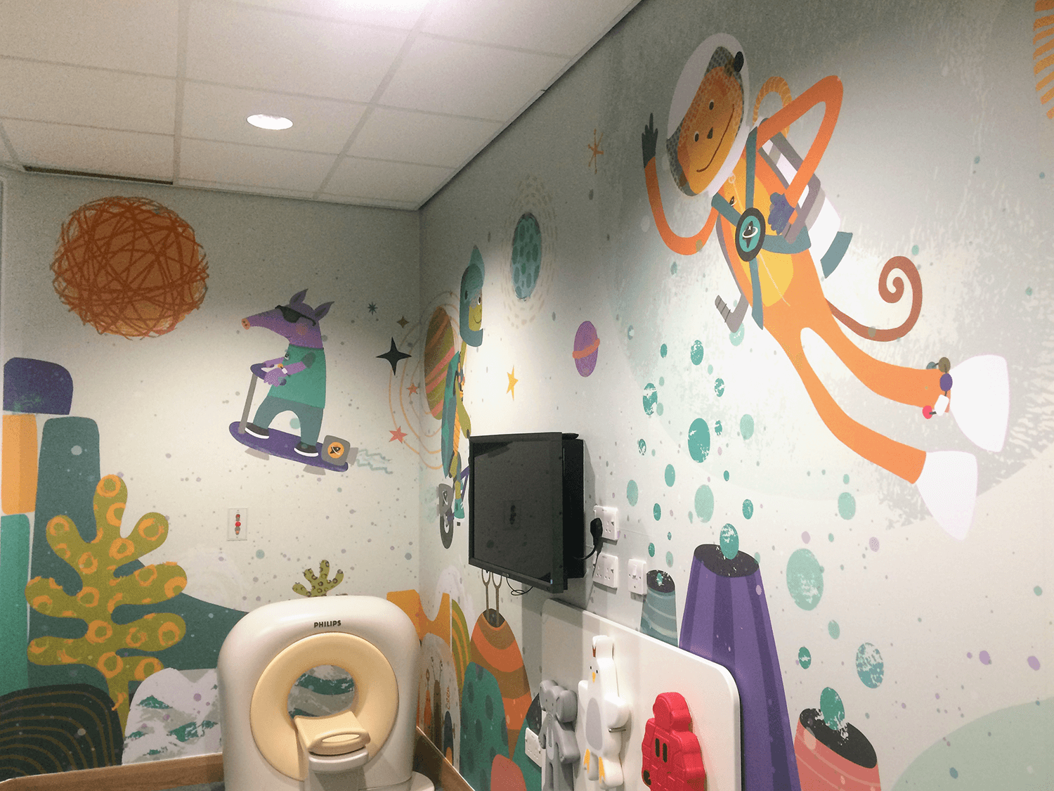
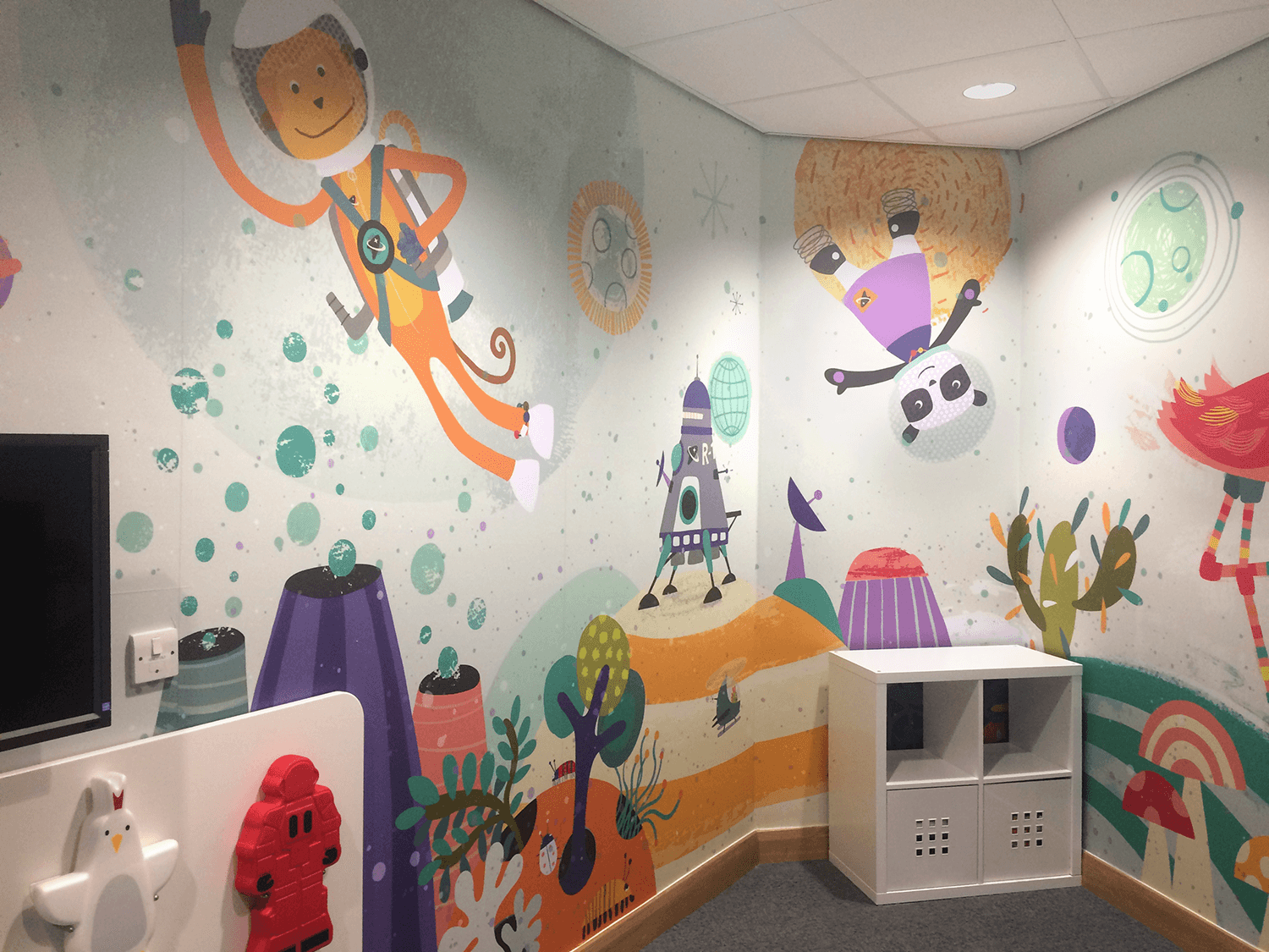
The waiting room mural depicts one such planet The Ruthership has brought them to. The gang have left the ship to explore on their various modes of personal space transport… basically ’spaced-up’ versions of BMX bikes, skateboards and rollerskates. Why walk when you can scoot on gyroscopic wheels?"
Initial sketches of the six proposed characters
Following the written treatment and an initial stage of mood boards to describe my approach for the mural design, I began the character development. We discussed the idea of basing the characters on animals to enable them to be non-human, but to remain friendly and recognisable.
Additional client directives were for me to try to relate the designs back to the journey the young cancer patients would be going through within their treatment. Specifically, during radiation treatment the children would likely need to wear a face mask which has very small holes in it, this can be quite a scary prospect as it severely limits the wearer's vision. Also, throughout their treatment children are given 'Beads of Courage' - basically a coloured bead they get to choose after each stage of treatment, to show how far they have come.
These details became integral to the character designs, with holes/dots being added to space helmets and each character wearing their beads (or colourful gemstones) in their own way! The space theme was kept fairly loose as we had agreed that the characters shouldn't be overly dressed in astronaut gear or fully kitted with breathing apparatus. (We assume the planet they’re visiting has an environment not dissimilar to our own.)


I worked up the first two characters from the sketch stage in my proposed style, for approval from the client before rolling out the full character set.
The full character line up, with names
My approach in terms of illustration style is quite graphic but with slightly organic feel, intentionally not too hard edged, cold or clinical.
Although The Rutherford have an existing brand colour palette, it was not felt that the mural needed to adhere to that, so I developed my own range of colours for the characters, which would also be used for the landscape/full mural.

The Ruthership and 'space' logo to add as a subtle detail on the character's clothing etc

I wanted the mural to feel vibrant and alive with organic forms, trees & plant life and alien insects etc. Playful shapes are integral to the landscape of the planet, making it like a natural skatepark, a space explorer’s playground. The background is neutral/pale coloured so not to be oppressive in the room, with the space theme accentuated by other planets & stars being visible.


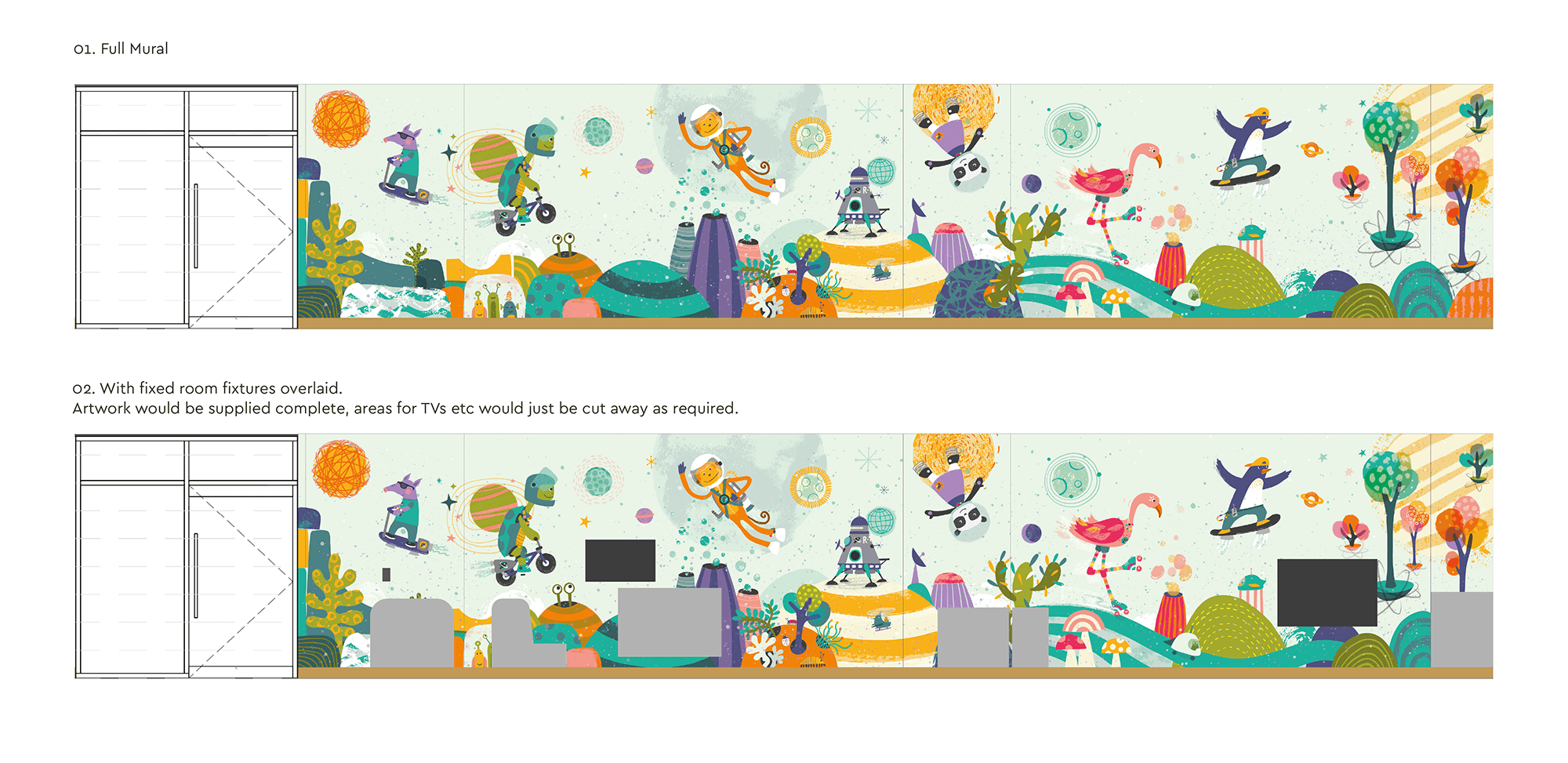
In designing the mural, there were certain fixed objects and furniture which would be in the room, and needed to be taken into account.
Based on building plans, a flattened out version of the room dimensions and fixed objects
The complete mural artwork (click to enlarge):
The approved mural sketch (click to enlarge):
Pictured below is my first version of the full mural sketch. The client felt that it was too busy (they may have been right)... so I re-worked a simpler version, which is what became the final mural.
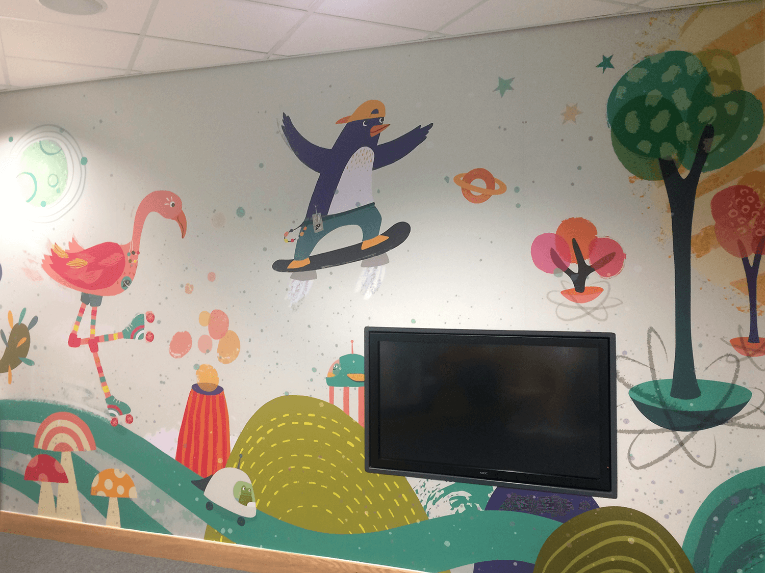
The client kindly sent me some photos of the installed mural. I intend to go and visit and take some more photos soon, but these give a pretty good idea of how it looks!

CLIENT FEEDBACK
" The mural looks amazing!!! Everyone loves it, it’s made such a difference for our young patients..."
- Emma Bigley, Marketing & Communications Officer, Rutherford Cancer Centre South Wales
RELATED PROJECTS
INNER CHIMP | A series of poster artworks for a junior school, to help teaching around the understanding of emotions

NOAH”S ARK ZOO FARM | A colourful zoo map for vistors