PROJECT: ORCHARD PROJECT DRINKS
CLIENT: THE ORCHARD PROJECT
The Orchard Project is the only national charity dedicated solely to the creation, restoration and celebration of community orchards. They work closely with community groups in hubs around England and Scotland helping to design and create new orchards and restore older orchards that will last for decades to come, as well as offering training and events to help groups make the most of their harvests.
This year The Orchard Project have launched a new 'community powered' juice and cider making enterprise, making produce from apples from community orchards and people's back gardens. Some of the final product is given back to the fruit donors and the rest is sold to help to fund their charitable activities.
OBJECTIVE
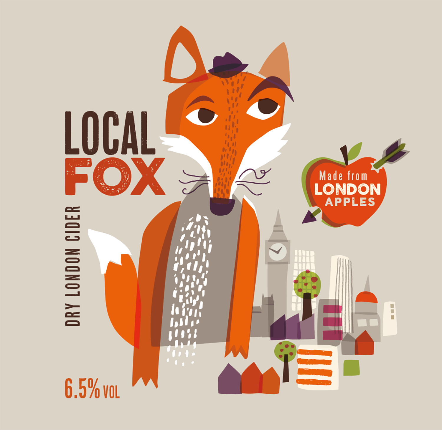
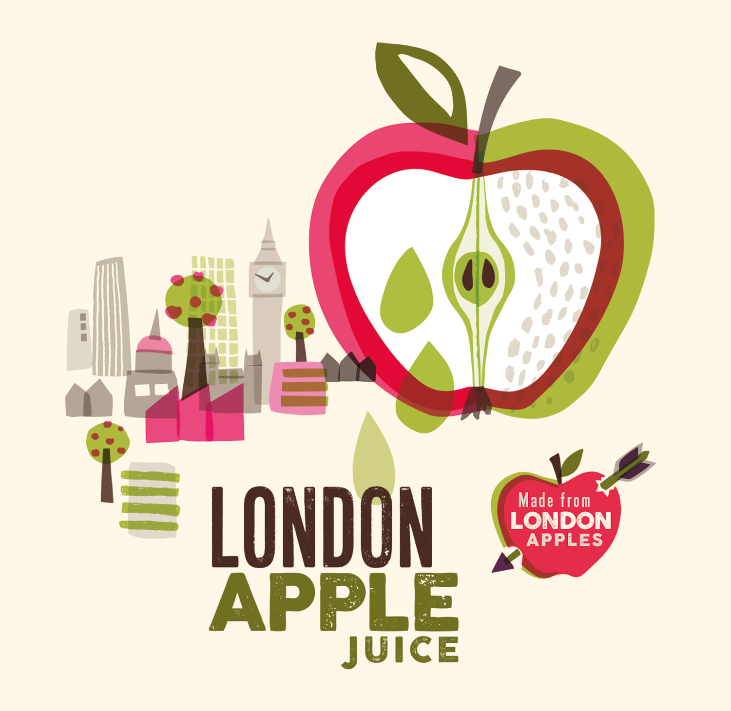
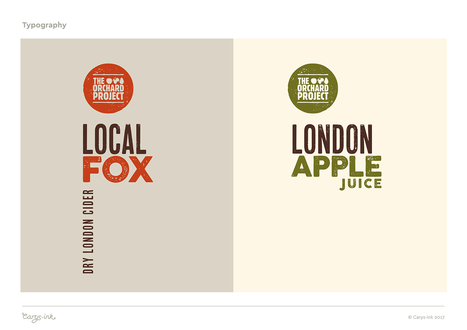
I was approached to develop a brand for The Orchard Project's new drinks enterprise, which would sit alongside the existing branding of the charity. The first two products from Orchard Project Drinks are Local Fox (a 2016 vintage, dry cider) & London Apple Juice, both of which have been hand made with help from volunteer orchardists, from a mix of apples collected and donated from community orchards and gardens across the London area - The products are 100% juice and a true taste of London!
Key directives of the brief were: firstly, to bring a strong illustrative approach to the packaging designs for the new apple juice and cider, and also that there should be a sense of the 'urban' nature of the products.

Visual showing the label designs applied to the various shape bottles.
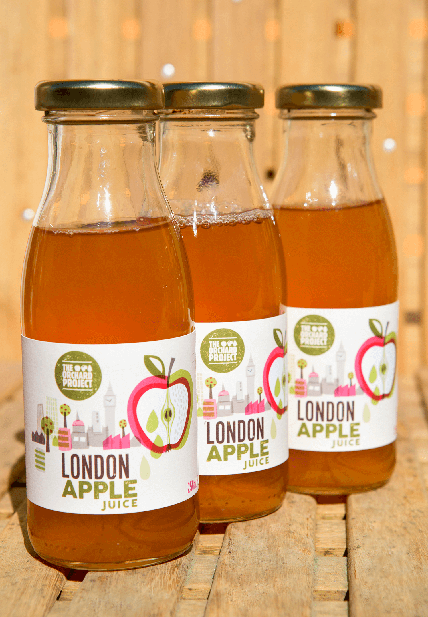
With the exception of the small apple juice, the circular Orchard Project mark appears on the bottle neck label to give a consistent prominence for the Orchard Project brand, across the product range.

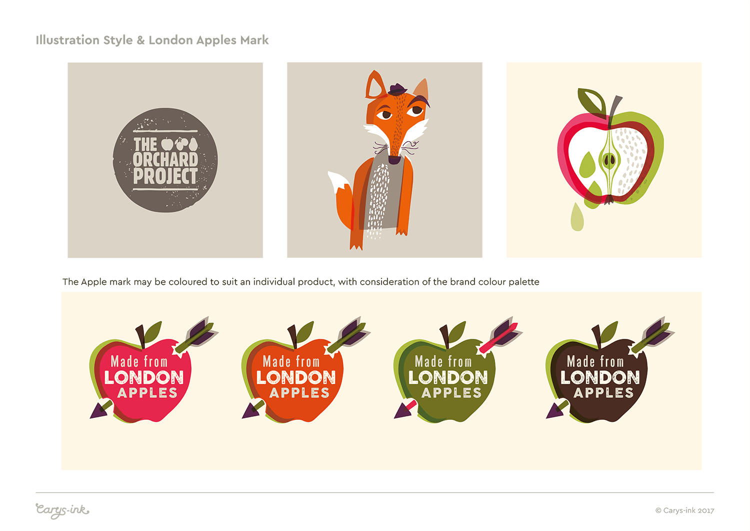
The developed designs use simple, organic shapes and marks to create a key illustration for each product - the fox for the cider and an apple for the apple juice - along with a suggestion of the London skyline and the idea that the apples come from trees within the city. I was keen for the London element not to feel too 'touristy' in the portrayal of different landmarks etc and so purposely kept this quite loose and flexible, to work in conjunction with the main illustrative element.
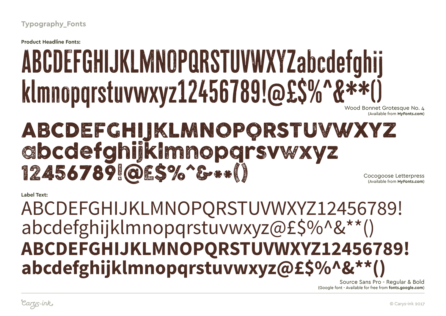
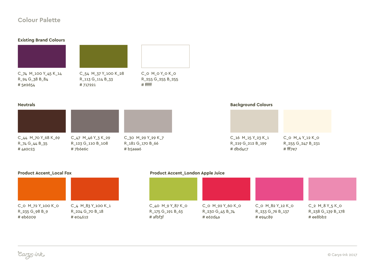
The style of the illustration and the typography are intended to have an organic, hand-crafted feel to be in-keeping with the products. Colours were selected to complement the existing Orchard Project brand, with the idea that each product would have it's own limited palette so that potentially any new products can be developed in the future with their own, individual character.


It's an important and interesting point that these products are made from 100% London Apples... this icon highlights that fact!
I mentioned above the hand-crafted style of the illustrations. The elements within the illustrations originated from cut paper shapes and marks made by hand, which I then scanned and worked with digitally to produce the finished illustrations. I like this approach because it brings an organic feel to the illustrations but allows me a lot of flexibility in the way the various elements overlap and work together...

PROCESS: Original component parts of the fox illustration cut from paper, with options on different shapes to play around with...
Pictured below: The flat, wraparound label designs, with text layout on the back.
There was also a 330ml layout for the Local Fox cider, but I haven't included it here, as it's not massively different to the 500ml!
Below are some pages from the Brand Delivery Guide I produced to supply along with the completed designs, showing some of the brand elements. These will carry forward as and when The Orchard Project introduce new products. It's likely that new illustration elements would be introduced to define different products in the range.


In true community spirit, The Orchard Project label their products by hand, with the help of volunteers. I was really interested to see some photos from the first labelling session... (click on an image to enlarge and view the set of images)


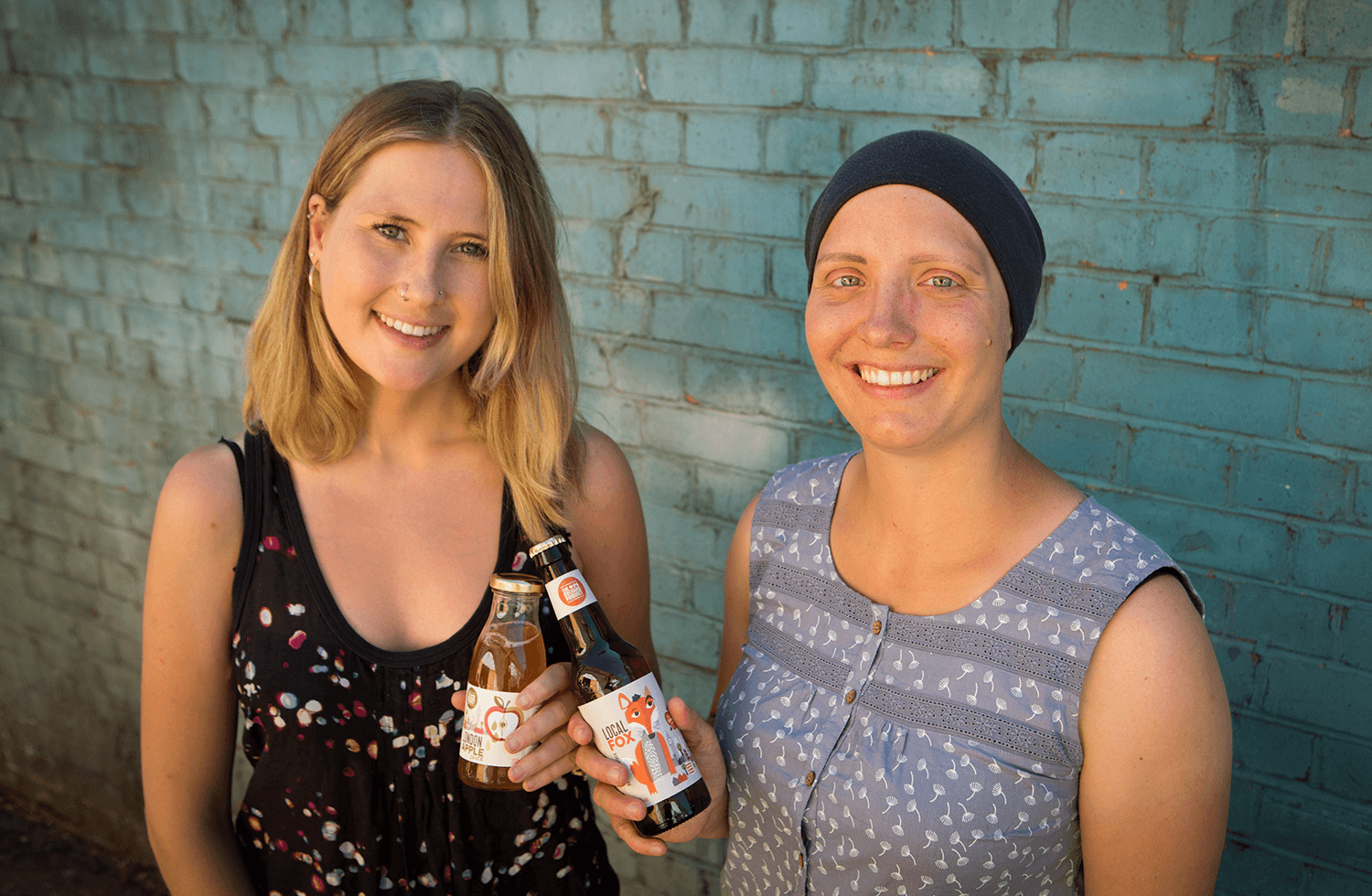


Product/Labelling Photos: ©Carmen Valino, courtesy of The Orchard Project
To publicise the products via social media and in print, it was necessary to create an image that combined both the products. Below are a couple of designs I created for this purpose, a 2-sided postcard and an event banner.

Postcard/Flyer, A6

Vinyl Event Banner, 5ft x 2ft
CLIENT PERSPECTIVE
To add a little context to this case study, once the project was complete I went back to the client - Abby Cremin, Project Director at The Orchard Project - and asked her a few questions. This has become part of my process as a follow-up after each job, I find it really useful to have feedback from a client perspective to help me understand what it's like for clients working with me and also to find out/make sure everyone is happy with the work I have delivered. I hope that this kind of feedback may equally be useful for potential clients thinking about working with me, so do read on....
In launching your new cider and juice enterprise I’m sure there have been many challenges, but what was the particular area you hoped Carys would be able to help you with?
We know that launching a new product into the craft drinks market there is stiff competition and we needed to have a design that would stand out and make people pick it up from the shelf. We wanted a bold and beautiful illustration that would represent what our product was about while still competing with bigger competitors.
I know you had you considered other creatives/agencies who may have been able to deliver this work, what was it that made you select Carys to work with?
Her previous projects were right up our street and we liked her business ethos, it aligned with what we are about. We were looking for someone that we believed we could develop a long-term relationship with who understood what we are trying to achieve.
How did you find the process… from the initial briefing through to the completion of your project? Was there anything you felt could have been better, or to try to improve for future projects?
The process went really well! We gave Carys all of the info and ideas that we'd been collecting and then discussed some initial ideas. The day that she came to present her design routes we were blown away by the amount of work that she had put in and how brilliant they all were. She was responsive, able to explain her design decisions, had great attention to detail and gave great advice. We hope to continue a long relationship.
It may be a little early to say, but what has the feedback so far been on the new designs?
People are really impressed, the take up from stockists of our product has been great and we believe that the packaging is one reason for this. People love the fox!
And finally, if you had to describe Carys to another individual/organisation looking to commission an illustrator or designer, what would you say?
Definitely speak with her. We are so pleased with our final results and it is everything and more that we hoped for. We believe that because of her design work our product stands out in a crowded marketplace and is something that we are proud is ours!
"It's been a real pleasure working with you Carys, thank you for making the process so painless and giving us a product that we love and feel excited about!"
- Abby Cremin Project Director | The Orchard Project
Cheers Abby!...What lovely feedback, I'm really pleased everyone is happy with the designs and I look forward to working with you again soon :-)

RELATED PROJECT

THE ORCHARD PROJECT | Membership Pack print materials

British Animation Awards | Cover Art for the Awards Event Programme