



PROJECT: BRAND REFRESH
CLIENT: FURNITURE 23
Furniture23 are a commercial furniture business with a fantastic knowledge of contemporary furniture and interior design products. They work with with architects, interior designers and directly with clients to source and supply furniture for all kinds of projects and places, across many business types including education, leisure, commercial and public sector.
(The new Furniture23 website is currently in development)
OBJECTIVE
To refresh the Furniture23 brand. There was an existing 23 mark which was liked by the client and myself, so we agreed not to deviate too much from the original version of this, but to freshen up the typography and how the typography worked alongside the mark. Also to integrate illustration into the core of the brand.
Starting points...
Left: The previous logo, originally designed by Peloton | Right: Moving card, illustrated by me to work with the previous logo
Ahead of this brand refresh Chris Fox, director of Furniture23, had previously approached me when the business were moving premises. I was commissioned to create an illustration for use on a moving card, with a general theme of moving furniture... something which is fairly synonymous with what they do as a business. The client had liked and enjoyed using this illustration and so it was developed to be a key part of the refreshed brand.
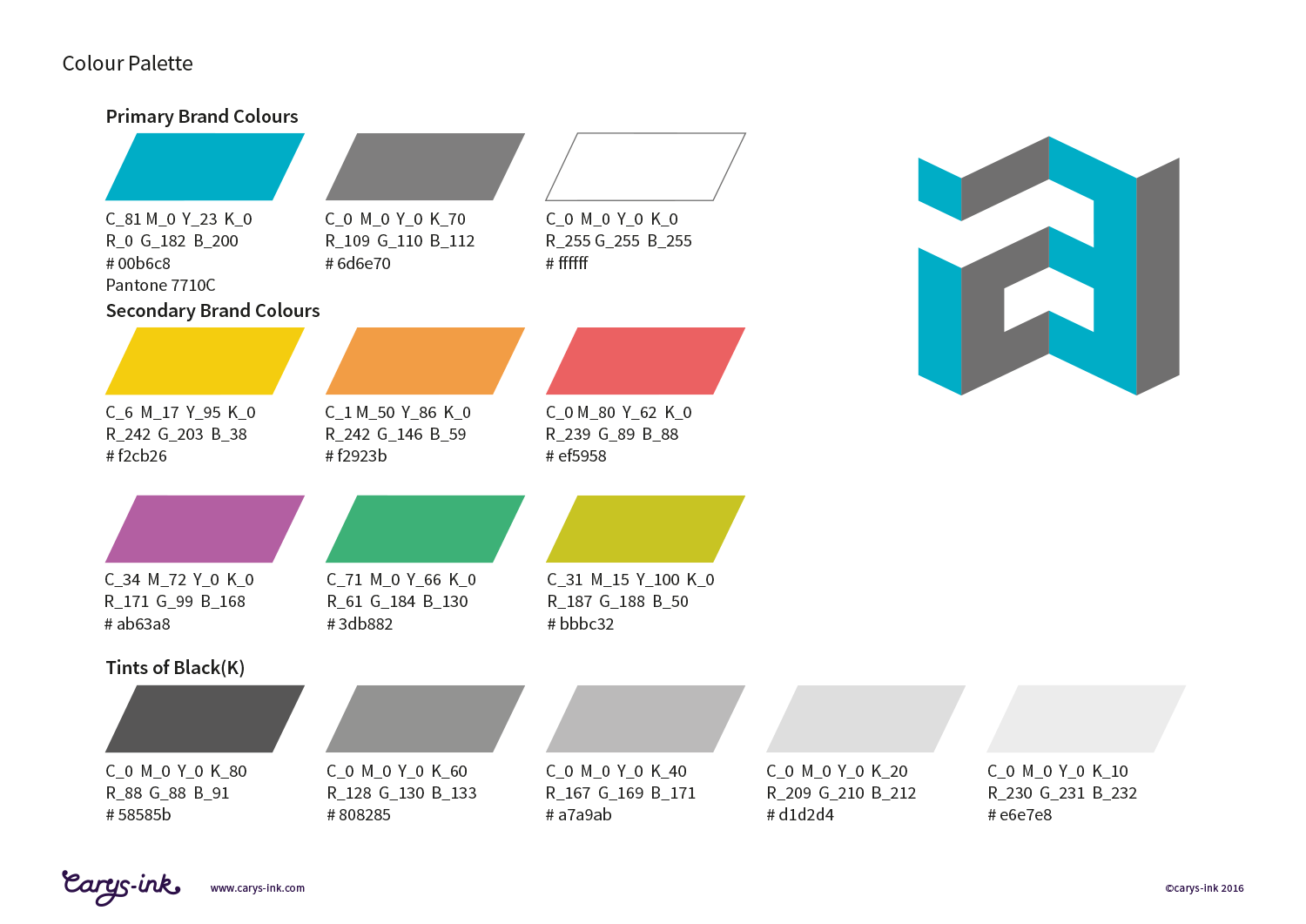
Within the brand development process I presented a number of colour options and variations, but it was decided that a small tweak to the blue of the original brand was all that was needed. The refreshed brand is very much a continuation of the previous version, but with a more contemporary feel.
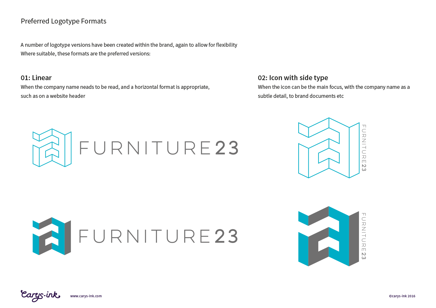
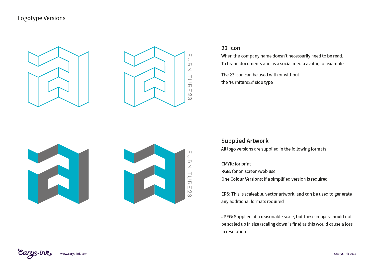
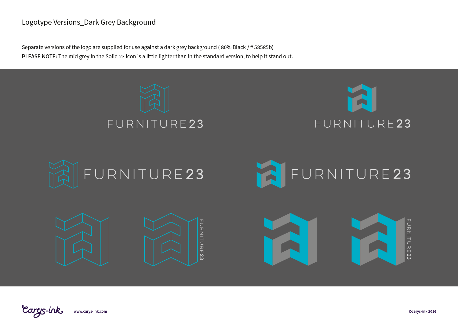
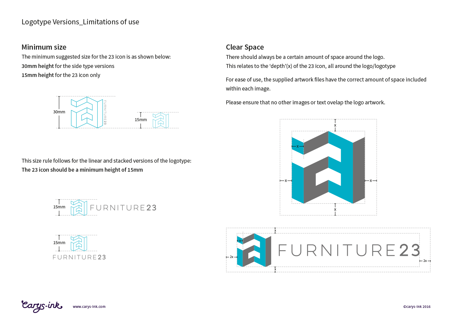
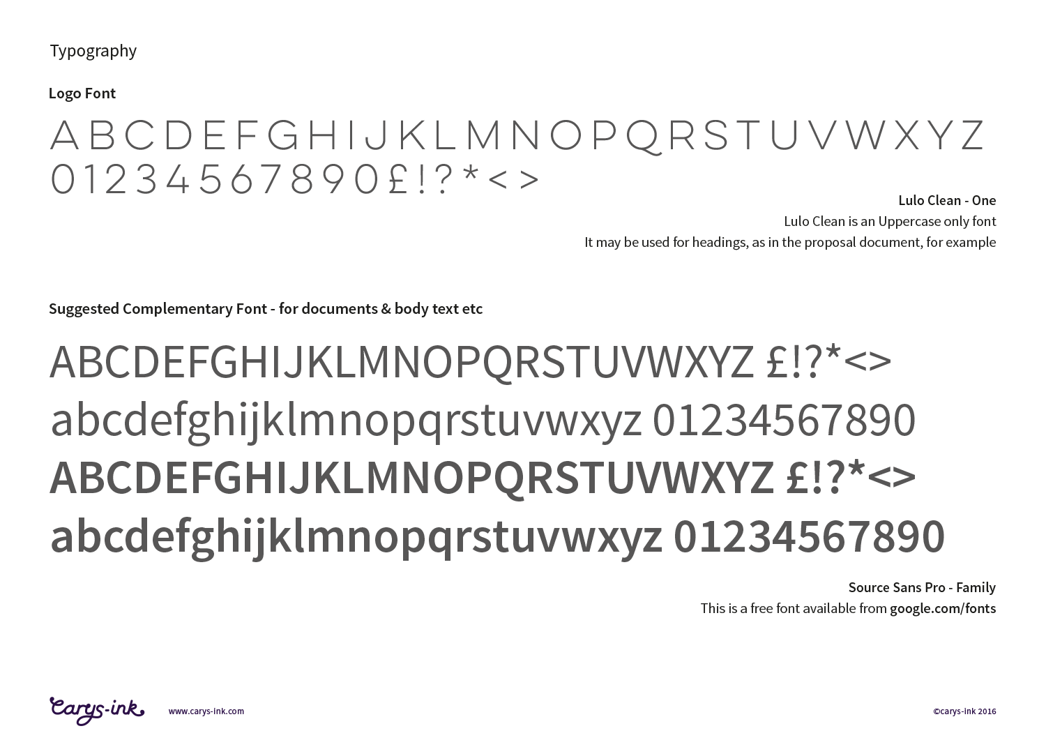
Pages from the Furniture23 Brand Delivery Guide, supplied to the client along with the various brand artwork and logo versions.






Each team member is represented by their favourite chair, for use in proposal documents.






I'll be honest, I very much enjoyed the task of illustrating designer chairs!
RELATED PROJECTS
Also with a clean, contemporary graphic style... Brand Identity for Remarkable Lives
